

The Art of White Space in Graphic Design
- Stella White
- Nov 6, 2025
- 4 min read

The Art of White Space in Graphic Design: Why Less is More
In the world of graphic design, there's a powerful principle that often goes underappreciated: white space. Also known as negative space, white space is the unmarked or empty areas within a design layout—the breathing room between elements that allows your design to truly shine. Contrary to what many beginners believe, white space isn't wasted space; it's a strategic design tool that separates exceptional work from the ordinary.
What Exactly is White Space?
White space refers to the empty areas in a design composition, including margins, gutters, and the space between text, images, and other visual elements. Despite its name, white space doesn't have to be white—it can be any color, texture, or background as long as it serves as a visual separator or buffer. The key distinction is that white space is intentional. It's a deliberate design choice made to enhance the overall composition, not simply leftover space that couldn't be filled.
Think of white space as the silence between musical notes. Just as silence gives music its rhythm and impact, white space gives design its clarity and power.

Why White Space Matters: The Core Benefits
1. Improves Readability and Legibility Adequate white space prevents visual clutter and makes content easier to scan and comprehend. When text and images have breathing room, viewers can process information more efficiently. This is especially critical in web design, where users often scan rather than read thoroughly.
2. Enhances Visual Clarity White space brings order and structure to a design, helping viewers navigate the composition without feeling overwhelmed. It creates a sense of organization that guides the eye naturally through the layout.
3. Creates Focus and Emphasis By isolating key elements with white space, designers can direct attention to what matters most—whether that's a headline, call-to-action button, or featured image. The more white space surrounding an element, the more important it appears.
4. Establishes Visual Hierarchy Varying the amount of white space around different elements creates a clear hierarchy. This helps viewers understand which information is most important and in what order they should consume the content.
5. Conveys Professionalism and Sophistication Designs with effective white space appear more polished, refined, and professional. Luxury brands, in particular, leverage white space to communicate exclusivity and elegance.
6. Reflects Brand Identity White space can embody a brand's values—simplicity, openness, innovation, and elegance. Minimalist brands use white space as a core part of their visual identity.
Where White Space Shines: Applications Across Design Disciplines
Print Design In magazines, books, and posters, white space enhances readability and creates balanced, visually appealing layouts. Magazine designers use white space strategically to separate articles and guide readers through content.
Web and Digital Design Websites and applications benefit tremendously from thoughtful white space. It improves user experience, reduces cognitive load, and makes navigation intuitive. Tech companies like Apple have built their design philosophy around generous white space.
Logo and Branding Iconic logos often employ white space cleverly. Think of the negative space in the FedEx logo or the Apple logo—these designs use white space to create additional meaning and sophistication.
Advertising and Marketing Effective ads use white space to highlight key messages and make designs more engaging. A single product on a white background often sells better than a cluttered composition.
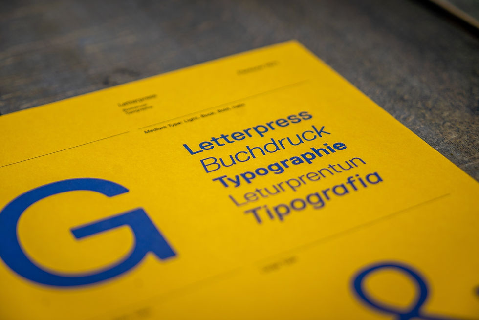
Typography White space between letters (kerning), words (word spacing), and lines (leading) dramatically affects readability and visual appeal. Proper spacing makes typography more elegant and easier to read.
Key Principles for Mastering White Space
1. Balance and Proportion White space helps achieve visual balance. Ensure that no part of your design feels too heavy or crowded. Consider the weight of visual elements and distribute white space accordingly.
2. Proximity and Grouping Use white space to group related elements together and separate unrelated ones. This aids in organizing content and helps viewers understand relationships between elements.
3. Hierarchy and Emphasis Allocate more white space around important elements to emphasize their significance. Less important elements can have less breathing room.
4. Embrace Minimalism White space is fundamental to minimalist design. Prioritize simplicity and clarity over decoration. Ask yourself: does every element serve a purpose?
5. Intentionality Every bit of white space should be purposeful. Avoid leaving gaps simply because you ran out of content. Instead, use white space as an active design element.
Practical Tips for Using White Space Effectively
Don't Fear Empty Space Many designers feel compelled to fill every pixel. Resist this urge. Empty space is not a problem to solve—it's a solution in itself.
Use White Space to Guide the Eye Strategic placement of white space can direct viewers' attention exactly where you want it. Use it to create visual pathways through your design.
Test Different Spacing Ratios Experiment with various amounts of white space. What works for one project might not work for another. A/B testing can reveal what resonates with your audience.
Consider Your Audience and Medium Different audiences and mediums require different approaches. A luxury fashion brand might use generous white space, while a children's book might use less. Web designs need more white space than print due to screen fatigue.
Balance Content with Breathing Room Aim for a balance between content and white space. A common rule of thumb is the 60-30-10 principle: 60% primary content, 30% secondary content, and 10% white space (though this varies by project).
Real-World Examples of White Space Excellence
Luxury brands like Chanel and Dior use expansive white space in their marketing materials to convey exclusivity and sophistication. Tech companies like Apple and Slack employ minimalist design with generous white space to communicate innovation and simplicity. High-end magazines use white space to separate articles and create visual breathing room. Award-winning websites often feature clean layouts with strategic white space that enhances user experience.
Conclusion: Elevate Your Design with White Space
White space is not a luxury in graphic design—it's a necessity. Whether you're designing a logo, website, advertisement, or print material, thoughtful use of white space elevates your work from good to exceptional. It communicates professionalism, guides your audience, and creates designs that resonate.
The next time you're working on a design project, resist the urge to fill every space. Instead, embrace the power of emptiness. Give your elements room to breathe, and watch as your designs become clearer, more impactful, and more memorable.
At DROR Studio, we believe that great design is about making intentional choices—and that includes knowing when to leave space empty. Whether you're looking to refine your design skills or need professional design services, remember: sometimes, less truly is more.


Comments