The Silent Language: How Typography Elevates Your Graphic Design
- Stella White
- Oct 17, 2025
- 3 min read
Updated: Nov 6, 2025
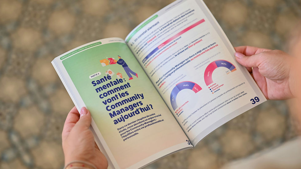
In the bustling world of graphic design, where vibrant colors and striking imagery often steal the spotlight, there's a powerful, often unsung hero working tirelessly behind the scenes: typography. More than just choosing pretty fonts, typography is the art and technique of arranging type to make written language legible, readable, and appealing when displayed. When wielded effectively, it can significantly impact your marketing and brand perception.
Think of typography as the silent language of your brand. Before a single word is even read, the typeface you choose, its size, spacing, and arrangement are already communicating a message, setting a tone, and shaping the user's experience. Here is how typography plays a crucial role in graphic design and why it should be a cornerstone of your marketing strategy:
Establishing Brand Identity and Personality
Your typeface selection is a fundamental component of your brand's visual identity.

Serif fonts, with their classic "feet," often convey tradition, authority, and elegance – perfect for a law firm or a luxury brand. Sans-serif fonts, known for their clean lines, project modernity, simplicity, and approachability, making them popular among tech companies and contemporary businesses. Script fonts evoke a sense of sophistication, personal touch, or artistic flair. The right font can instantly communicate whether your brand is playful or serious, traditional or innovative, luxurious or accessible. Consistency in your typography across all marketing materials reinforces this identity and builds recognition.
Enhancing Readability and User Experience
Ultimately, the primary goal of typography is to make text easy to read. Poor typography can quickly frustrate a reader, leading them to abandon your content.
Important elements like font size, line height (leading), letter spacing (kerning), and line length all contribute to readability. Websites with clear, well-structured typography retain visitors longer, improving engagement and conversion rates. In print, good typography ensures your brochures, flyers, and advertisements are absorbed efficiently.
Guiding the Reader's Eye
Effective typography creates a visual hierarchy that guides your audience through the content.

Varying font sizes for headlines, subheadings, and body text, using bold or italic styles, and employing different font weights can draw attention to key messages and make complex information digestible. This visual prioritization helps users quickly grasp the most important information, whether it's a call to action on a landing page or the main points of an infographic.
Evoking Emotion and Setting the Tone
Beyond legibility, typography can powerfully evoke emotions and set the overall tone for your communication. A delicate, flowing script might convey elegance or romance, while a bold, condensed sans-serif could signify strength and urgency. The subtle curves, sharp angles, or organic forms of a typeface can create an emotional connection with the viewer, influencing how they perceive your brand and message. This emotional resonance is invaluable in marketing, helping to create memorable experiences and foster brand loyalty.
Boosting Professionalism and Credibility
Carefully chosen and expertly applied typography signals professionalism and attention to detail.

Inconsistent or poorly executed typography can make a brand appear amateurish and untrustworthy. Conversely, thoughtful typography demonstrates that you care about your presentation and, by extension, your customers. This builds credibility and trust, essential ingredients for successful marketing and long-term business relationships.
The Bottom Line
In the dynamic world of graphic design, typography is far more than just a stylistic choice. It's a strategic tool that directly impacts brand identity, user experience, emotional connection, and ultimately, your marketing effectiveness. By investing in well-crafted typography, you're investing in clearer communication, stronger brand recognition, and a more professional image.
Conclusion
Typography is not just about aesthetics; it’s about creating a connection. When you choose the right typeface, you’re not only enhancing your brand’s identity but also improving the overall user experience. Remember, your typography speaks volumes about who you are as a business.
For expert insights and cutting-edge design solutions that harness the full power of typography, visit www.drorstudio.com. Let your typography speak volumes for your brand.
Additional Resources
Typography Basics: Understanding the fundamentals of typography can greatly enhance your design skills.
Choosing the Right Font: A guide to selecting the perfect typeface for your brand.
Typography Trends: Stay updated with the latest trends in typography to keep your designs fresh and engaging.
By focusing on typography, you can elevate your brand's presence and ensure that your message resonates with your audience. Embrace the power of typography and watch your brand flourish!


Comments