

A Closer Look at…. Contrast (Part 1)
- Stella White
- May 22, 2023
- 3 min read

Contrast, an important principle of design, refers to the differences in visual elements within a composition. It is commonly applied to provide visual interest in order to communicate information effectively. Yet, its application does not stop there – when used appropriately, it can evoke a wide range of emotions and bring home a powerful message. Some applications of contrast include:
Colour
The human eye can see millions of colours and that is why colours are such a huge part of our lives. Even designers and artists who work with colours on a daily basis often find themselves pondering what palettes best suit their next project or masterpiece.
Complementary colour combinations serve as a quick and convenient way to pick out colours that provide maximum contrast since they represent two opposite colours on the colour wheel. They project energy and dynamism and are often represented in the branding of fast-moving consumer goods (FMCG), food and sports companies. They can also help to highlight crucial pieces of information against a muted background or amid blocks of text, hence reinforcing memory.

The yellow ball on the left pops up against a blue background.
However, such combinations are equally tricky to apply. As complementary colours enhance the vibrancy of each other, liberal application without deliberating on their contextual suitability can leave a harsh impression on the viewer.
Unless specifically requested by the client, one may also wish to avoid the use of conventional colour combinations for practical reasons. The brain’s tendency to associate certain colours with special events or other renowned brands more often than not diminishes the impact of these colours in design. A classic example would be the pairing of red and green and how to execute it perfectly without having the idea of Christmas conjured in one’s head.
Typography
When we talk about contrast in typography, properties such as font size, weight and family tend to come to mind naturally. Indeed, having a variation of these in a composition helps to establish a hierarchy that allows the viewer’s eye to be guided along an intended path or to the most crucial section.
Large, bold words grab attention effectively and are suitable as headlines but one should also pay attention to the presentation of body copy to ensure enough contrast and readability. A general rule of thumb would be to double or to half the point size – where body copy is in 10pt, headlines can be upped to 20 or more for greater impact. It is also common to differentiate the headlines from the body copy through the appropriate pairing of sans serif and serif typefaces. However, contrast in typography is not limited to the abovementioned. Other properties such as position, colour and case should also be duly considered in the early design stages.
Perhaps the most influential representation of typography at work is the Swiss Style (also known as International Typographic Style). It is a graphic design style that started in the 1920s and remains popular to this day. The Swiss Style often engages dramatic use of contrasting typography, shapes and colours to convey messages in an explicit way. Some of its early practitioners include Ernst Keller, Armin Hoffman and Josef Müller-Brockmann.
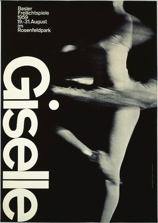
Giselle, Basler Freilichtspiele (1959)
Credits: Armin Hofmann (Designer)
Image
Contrast can be played up effectively when images that are unlikely to co-exist in daily life are placed adjacent to each other in a composition. Images such as day and night or summer and winter are shown in advertisements because of the high visual interest they create. The example below shows how wealth and poverty are juxtaposed to urge people to rethink their spending habits and how they can better contribute to society. The advertisement makes a strong reference to the aesthetics of high fashion magazines but its choice of model – an impoverished woman – allows one to dive beyond the surface to the important message behind.

Credits: Cordaid
Contrast needs not be complicated to deliver a message. Some of the most iconic designs in history consist of only one contrasting element. Yet, they remain popular and relevant over a long time for the exact same reason – they are less busy to look at and therefore easier to remember.
In the second part, we shall cover the other elements of contrast such as shapes, layout and scale.


Comments