

Achieving Visual Harmony: The Importance of Balance in Graphic Design
- Stella White
- Nov 10, 2025
- 4 min read

Creating a design that feels right to the eye is not just about choosing the right colors or fonts. One of the most crucial elements that determine how a design is perceived is balance. Without it, even the most creative ideas can feel chaotic or uncomfortable. This post explores why balance matters in graphic design and how you can use it to create visually pleasing work.
What Balance Means in Graphic Design
Balance in graphic design refers to the distribution of visual weight within a composition. Visual weight comes from elements like size, color, texture, and shape. When these elements are arranged so that no part of the design feels heavier or more dominant than others, the design achieves balance.
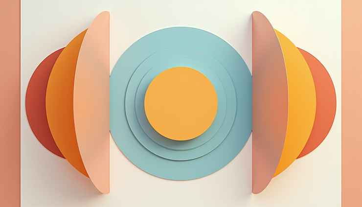
There are three main types of balance used in graphic design:
Symmetrical balance: Elements are mirrored on either side of a central axis. This creates a formal, stable feeling.
Asymmetrical balance: Different elements are arranged unevenly but still achieve a sense of equilibrium through contrast and positioning.
Radial balance: Elements radiate out from a central point, creating a circular balance.
Each type serves different purposes and moods. Symmetrical balance often feels calm and orderly, while asymmetrical balance can feel dynamic and interesting. Radial balance draws attention to the center and is great for focal points.
Why Balance Matters for Visual Communication
Balance is not just about aesthetics. It plays a key role in how viewers process information. A well-balanced design guides the eye naturally through the content, making it easier to understand and remember.
When a design lacks balance, it can cause confusion or discomfort. For example, if one side of a poster is crowded with large images and the other side is mostly empty, the viewer’s eye may feel pulled too strongly in one direction. This imbalance can distract from the message.
Good balance also helps establish hierarchy. By carefully placing elements with different visual weights, designers can highlight the most important parts of the message while supporting details remain secondary.
Practical Tips for Creating Balance in Your Designs
Achieving balance requires thoughtful planning and experimentation. Here are some practical ways to create balance in your graphic design projects:
Use size and scale wisely
Large elements carry more visual weight. Pair a large shape with several smaller ones to balance the composition.
Consider color and contrast
Bright or saturated colors attract attention and add weight. Balance a bright element with a neutral or darker one.
Pay attention to texture and detail
Areas with intricate patterns or textures feel heavier than plain spaces. Use texture to balance empty areas.
Position elements carefully
Elements placed closer to the edge of a design feel heavier than those near the center. Use this to your advantage when arranging components.
Use grids and guides
Grids help maintain consistent spacing and alignment, which supports balanced layouts.
Experimenting with these factors will help you find the right balance for each project. Remember, balance does not mean everything must be equal. It means the elements work together to create a stable and pleasing whole.

Examples of Balance in Graphic Design
Looking at real-world examples can clarify how balance works in practice.
Magazine layouts often use symmetrical balance for a clean, organized look. Headlines, images, and text blocks are aligned evenly on the page.
Website homepages frequently use asymmetrical balance to create interest. A large image on one side might be balanced by smaller text and buttons on the other.
Logo designs sometimes use radial balance, with shapes or text arranged around a central point to create a strong focal mark.
One famous example is the Apple logo. It uses simple shapes arranged with perfect symmetry, giving it a timeless and balanced appearance. On the other hand, many modern websites use asymmetrical layouts to feel fresh and dynamic while still maintaining balance through color and spacing.
Common Mistakes to Avoid
Even experienced designers can struggle with balance. Here are some pitfalls to watch out for:
Overcrowding one side
Too many elements on one side create visual tension and confusion.
Ignoring negative space
Empty space is just as important as filled space. It helps balance heavier elements.
Using too many bright colors together
This can make the design feel chaotic rather than balanced.
Misplacing focal points
If the main element is off-center without support, the design may feel lopsided.
Taking time to step back and view your design as a whole can help catch these issues before finalizing your work.
How Balance Enhances User Experience
Balance also impacts how users interact with designs, especially in digital formats. Balanced layouts improve readability and navigation by making content easier to scan and understand.
For example, a balanced website layout helps users find important buttons or information quickly. It reduces cognitive load, meaning users don’t have to work hard to figure out where to look next.
In print design, balance can make reading more comfortable by preventing eye strain. This is especially important for long-form content like books or brochures.
Final Thoughts on Using Balance in Graphic Design
Balance is a foundational principle that shapes how people experience visual content. It supports clarity, focus, and aesthetic appeal. By mastering balance, designers can create work that feels intentional and engaging.
Next time you start a design, consider how the elements relate to each other in terms of weight and placement. Use size, color, texture, and position to create harmony. Balance is not about making everything equal but about making everything work together.


Comments